

Jane Gottlieb has spent decades chasing joy through color. Based in Los Angeles, she began as a painter and transitioned into photography, eventually finding a new language through hand-painted prints. Over 30 years ago, she began painting directly onto Cibachrome photographs—a hands-on, labor-intensive process that blended photography with the spirit of painting. She didn’t stop there. Today, she brings her original prints into the digital realm, scanning and transforming them with Photoshop into vivid, high-energy works printed on aluminum, canvas, or paper.
Her style is instantly recognizable—bright, bold, and unapologetically optimistic. It’s not about subtlety. It’s about saturation. Gottlieb’s work is fueled by her belief in the emotional power of color. For her, making art isn’t just about creating images—it’s about generating joy. Color is her tool, her language, and her way of making sense of the world. It’s how she lifts her own spirits and, hopefully, those of anyone who views her work.
Her large-scale installations at UCLA and UCSB—over 140 works combined—are a testament to how her vision resonates. The pieces are set to be on view for a decade, standing as bright interruptions in the visual noise of institutional space. She sees these as gifts of light and energy to anyone passing through. For Jane Gottlieb, art isn’t meant to be elite or remote. It’s meant to be shared. To bring a smile. To remind you that beauty can be bold.
Frank Gehry Series
Jane Gottlieb’s Frank Gehry series is a love letter to one architect’s mind and another artist’s obsession with form and color. Gottlieb once worked directly with Gehry, photographing his designs decades ago. That early connection became a long fascination. She’s been photographing his buildings ever since, particularly his sculptural marvels in Los Angeles and Bilbao. But in Gottlieb’s hands, these aren’t just photos. They’re hybrids—somewhere between documentation and daydream.
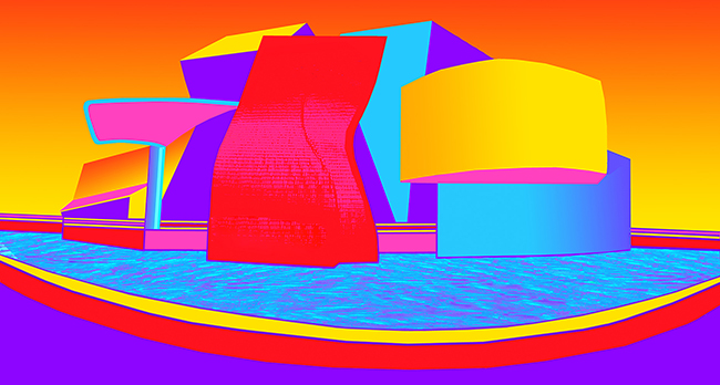
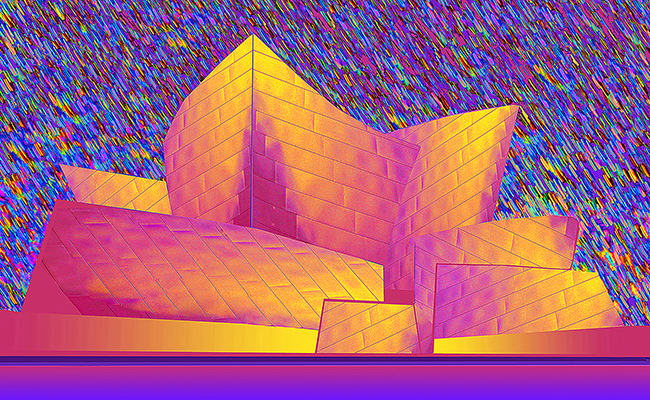
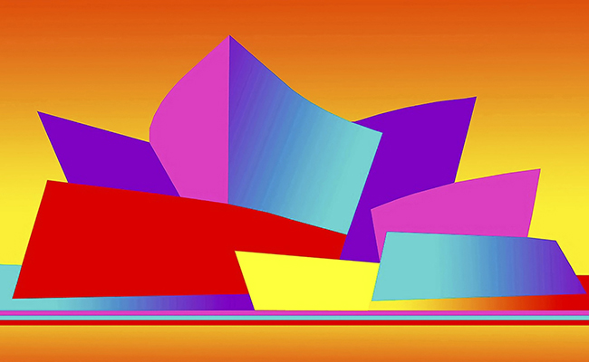
She takes Gehry’s already playful architecture and pushes it further. Walls bend. Colors pop. Steel morphs into saturated planes of magenta, cyan, lemon yellow, and electric orange. These buildings were already unconventional—but through Gottlieb’s lens and editing, they become surreal. She flattens space, twists shadows, and swaps real-world palettes for something closer to fantasy. But even in their wildest versions, the structures are still recognizable. You can tell it’s Gehry—but you’re seeing it through Jane’s filter: exuberant, curious, and deeply alive.

In some pieces, she leaves hints of water or sky, anchoring the architecture in a kind of altered world. Other times, the background vanishes into color gradients—fiery oranges melting into acid pinks or candy purples. Each composition becomes a visual hit of energy. There’s movement in the stillness, like something about to burst open.
Photoshop is her brush now, and she uses it not to correct or manipulate reality, but to reimagine it. Her colors don’t follow nature—they follow feeling. She’s not interested in accuracy. She’s interested in effect. What will make someone stop and smile? What will jolt someone out of their routine just long enough to look?
That’s what this series is really about. Yes, it’s about Gehry’s architecture—his curves, his asymmetries, his rebellion against the box. But it’s also about Gottlieb’s way of seeing. Her reverence for structure is clear, but so is her refusal to treat anything too seriously. Her edits aren’t reverent—they’re playful. It’s a conversation between two visual minds, one building in steel, the other in pixels.
This is how Jane Gottlieb works. She takes something she loves—architecture, landscape, cars, palm trees—and throws color at it until it becomes something else. Not better. Just hers. This Frank Gehry series isn’t just about buildings. It’s about freedom. It’s about taking the rigid and making it soft. Taking the real and making it bright. Taking a memory from 40 years ago and turning it into something fresh—something impossible to ignore.