

Oenone Hammersley is an artist with her feet in the earth and her eyes on the living world. Her work is built around a deep connection to nature—rainforests, wildlife, rivers, and skies. Known for her vivid paintings that blend realism with abstraction, Hammersley doesn’t just paint what she sees—she paints what she feels about the planet. Her art explores the tension between beauty and fragility, using layers of color and texture to express environmental urgency without being heavy-handed. Hammersley’s paintings carry a quiet reverence, a kind of visual prayer for the wild spaces still untouched. She reminds us of what we stand to lose, but also of what we still have to protect. From wildlife scenes to abstract river systems, her work invites you to look closer—and care more.
Her upcoming exhibitions include the Art 3F Paris Art Fair, September 26–28, 2025, and Le Carrousel du Louvre Art Fair in Paris, October 17–19, 2025—both in the Parcus Gallery booth. She will also be featured in Art Miami, December 2–8, 2025, with the Walter Wickiser Gallery. More of her work can be explored at www.oenonehammersley.com.
Rainbow River Series: A Conversation in Color and Flow
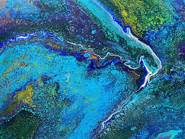
Rainbow River 1
“Rainbow River 1” is more than just a river on canvas—it feels like a current you could fall into. There’s a sense of fluidity here, a natural pull that mirrors how water moves through the world. The blues are layered, some so deep they edge toward black, others light and almost translucent. It’s not just color—it’s mood, it’s movement. You get the feeling that if you touched the surface, it would ripple.
Through the cool blues, flashes of orange and green break through, like reflections on a real river when sunlight hits just right. These colors aren’t loud, but they’re deliberate. They create contrast without chaos, giving your eye places to rest and then pulling it along again. Hammersley seems to understand how rivers shift—how they hold both peace and urgency at once.
The texture adds another layer. The paint isn’t smooth—it moves, builds, drags. That roughness gives the piece a physical presence. You’re not just looking at a river. You’re looking into it.
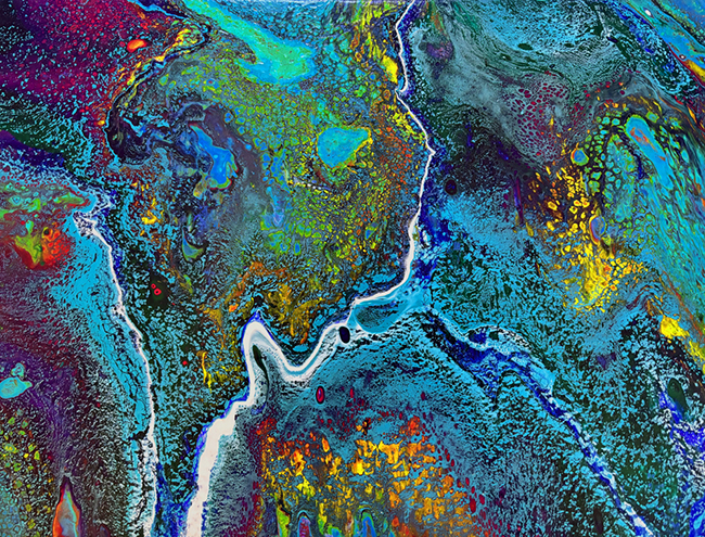
Rainbow River 2
“Rainbow River 2” keeps the current going, but this time the mood shifts slightly. Where the first canvas was cooler and more contemplative, this one turns up the temperature. Rich greens and fiery oranges start to dominate the frame, but they don’t overwhelm it. There’s still a base of blue underneath, anchoring the chaos in calm.
What makes this piece work is the rhythm. The colors are placed in a way that mimics nature—there’s no perfect symmetry, but everything feels balanced. The orange doesn’t just sit on top of the green. It seeps into it. The edges blur. The forms bend and pull, as though the whole thing is alive and pulsing under the surface.
It’s not about depicting a specific place—it’s about capturing what a place feels like. That’s what Hammersley does so well. She gives you a moment in motion. A reminder that rivers don’t stop.
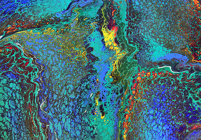
Rainbow River 3
“Rainbow River 3” is where the series really opens up. This piece feels more expansive, like the river has left its banks and spilled into something wilder. The blues are still here, grounding the work, but they take a back seat to the riot of color that bursts across the canvas.
Red, yellow, green—they’re all here, but they’re not battling for space. They’re weaving. You can almost trace the paths each pigment takes as it twists and blends, never fully disappearing, just changing form. The painting has energy. You get the sense of something just beneath the surface—maybe a storm, maybe a heartbeat.
What’s most striking is how the layers interact. Some colors sit on top, bold and clear. Others lurk underneath, visible only when you stop and stare. That layering gives depth, but it also gives time. These aren’t paintings you glance at. They ask you to stay, to notice the slow bloom of texture, the way everything is in motion even when it’s still.
Together, the Rainbow River series is a meditation on movement, on nature’s rhythm, on change. Hammersley doesn’t spell anything out, but the message is there—flow, adapt, survive. It’s a reminder that water carries memory, that rivers shape the land quietly, and that beauty and danger often exist in the same place.
In these works, abstraction meets environmental storytelling. Not with loud alarms, but with steady, persistent color—like water itself.